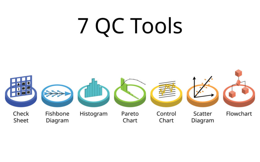
The 7 QC (Quality Control) tools, also known as the 7 Basic Tools of Quality, are a set of techniques used for process improvement and problem-solving in various industries. These tools are fundamental in identifying, analyzing, and resolving quality-related issues. Here’s an overview of the 7 QC tools:
- Check Sheets:
- Check sheets, also known as tally sheets or defect sheets, are simple forms used to collect and organize data in a systematic manner.
- They help in recording occurrences of specific events, defects, or observations over time.
- Check sheets facilitate data collection and analysis, aiding in identifying trends, patterns, or areas for improvement.
- Histograms:
- Histograms are graphical representations of data distribution, showing the frequency or count of data within predefined intervals or bins.
- They provide insights into the variation and central tendency of a process, helping to assess process capability and identify potential issues.
- Histograms assist in visualizing data patterns and making informed decisions based on data analysis.
- Pareto Charts:
- Pareto charts prioritize and display the most significant factors contributing to a problem or outcome, based on the Pareto principle.
- They organize causes or categories in descending order of frequency or impact, highlighting the vital few from the trivial many.
- Pareto charts aid in focusing improvement efforts on addressing the most impactful issues first, leading to efficient resource allocation and problem resolution.
- Cause-and-Effect Diagrams (Fishbone Diagrams):
- Cause-and-effect diagrams, also known as Fishbone diagrams or Ishikawa diagrams, visually depict the potential causes contributing to a specific problem or effect.
- They categorize causes into major categories such as people, process, equipment, environment, and materials.
- Cause-and-effect diagrams facilitate systematic problem-solving and root cause analysis by organizing and exploring potential causes in a structured manner.
- Scatter Diagrams:
- Scatter diagrams, also known as scatter plots, display the relationship between two variables by plotting data points on a graph.
- They help in identifying correlations, trends, or patterns between variables, enabling data-driven decision-making.
- Scatter diagrams assist in assessing the strength and direction of the relationship between variables, aiding in problem diagnosis and analysis.
- Control Charts:
- Control charts monitor process performance over time by plotting data points and establishing control limits based on statistical analysis.
- They distinguish between common cause variation (inherent to the process) and special cause variation (resulting from external factors or anomalies).
- Control charts enable proactive monitoring, intervention, and continuous improvement by identifying process stability and deviations from the norm.
- Flowcharts:
- Flowcharts visually depict the sequence of steps or activities within a process, including decision points, inputs, outputs, and subprocesses.
- They provide a clear and structured representation of workflow, facilitating process documentation, analysis, and optimization.
- Flowcharts assist in identifying bottlenecks, redundancies, or opportunities for streamlining, thereby improving process efficiency and effectiveness.
These 7 QC tools are invaluable resources for organizations seeking to enhance quality, optimize processes, and achieve continuous improvement across various functions and industries.
